Giant Eagle: Loyalty Dashboard
Giant Eagle launched a new customer rewards program called "myPerks" which rebranded and simplified the rules for rewards redemption. The plan was to gradually transition customers from Fuelperks, the legacy loyalty program, to myPerks, the new rebrand, where both the old and new program will exist in parallel until Fuelperks is phased out.
The Industry
Hatched Labs is a think tank designing and developing digital experiences for Giant Eagle, an American supermarket chain with stores in Pennsylvania, Ohio, West Virginia, Indiana, and Maryland.
1
My Role
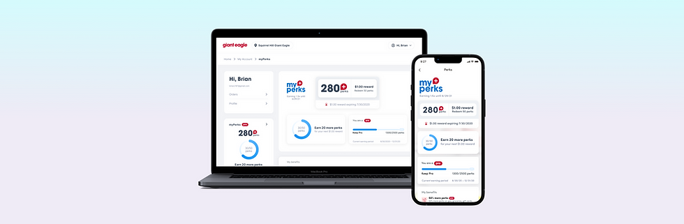
I designed loyalty program account pages for iOS, Android, and Web Responsive. I worked with a product manager and feedback from the extended design team to create medium fidelity to high fidelity wireframes.
2
The Team
The core product team consisted of the Product Manager, the Stakeholder representing Hatched Labs to Giant Eagle, and myself. I also collaborated with other Hatched Labs designers to align on the new aesthetic for the new Hatched Labs version of the Giant Eagle grocery app.
3
The Product
The Hatched Labs version of the Giant Eagle grocery app had an accounts page, but not a loyalty program page. There were also old designs for a mobile version of the myPerks program page which Giant Eagle designers created to match the aesthetic of the original grocery website.
2
Duration
It took 2 weeks to complete the redesign.
Challenges
While communicating via text message with their clients was straight forward, scheduling weekly workouts (new design pictured in the center panel above) was unintuitive for the coaches and required in depth instruction from coach managers.
1
Requirements
Two tiers of membership for myPerks, 3 states:
-
Customers who enroll in the myPerks program automatically enter the basic membership.
-
Customers who earn enough perks will enter the myPeks Pro program earning 50% more rewards than the basic membership.
-
There would be 3 states, the basic membership, the Pro, and a temporary "unlocking" Pro membership state.
2
Visual
Layouts that work for both Fuelperks and myPerks:
-
Fuelperks had more complex redemption rules than myPerks.
-
The layout also needed to integrate with a new visual redesign of the accounts page
-
There are also a few super users of the loyalty program, who may earn tens of thousands of perks before redeeming, the design would need to accommodate such super users.
3
Functionality
Checkout Integration:
-
We also needed to integrate the ability for customers to opt in to redeeming perks during checkout.
-
Empty States for when there are no perks to redeem
References
The existing Hatched Labs Giant Eagle grocery app accounts page showed some loyalty program information.
I also referenced legacy designs for a mobile myPerks program page created by Giant Eagle in-house designers to match the aesthetic of the legacy grocery website.


